
SignalPoint Mobility Management
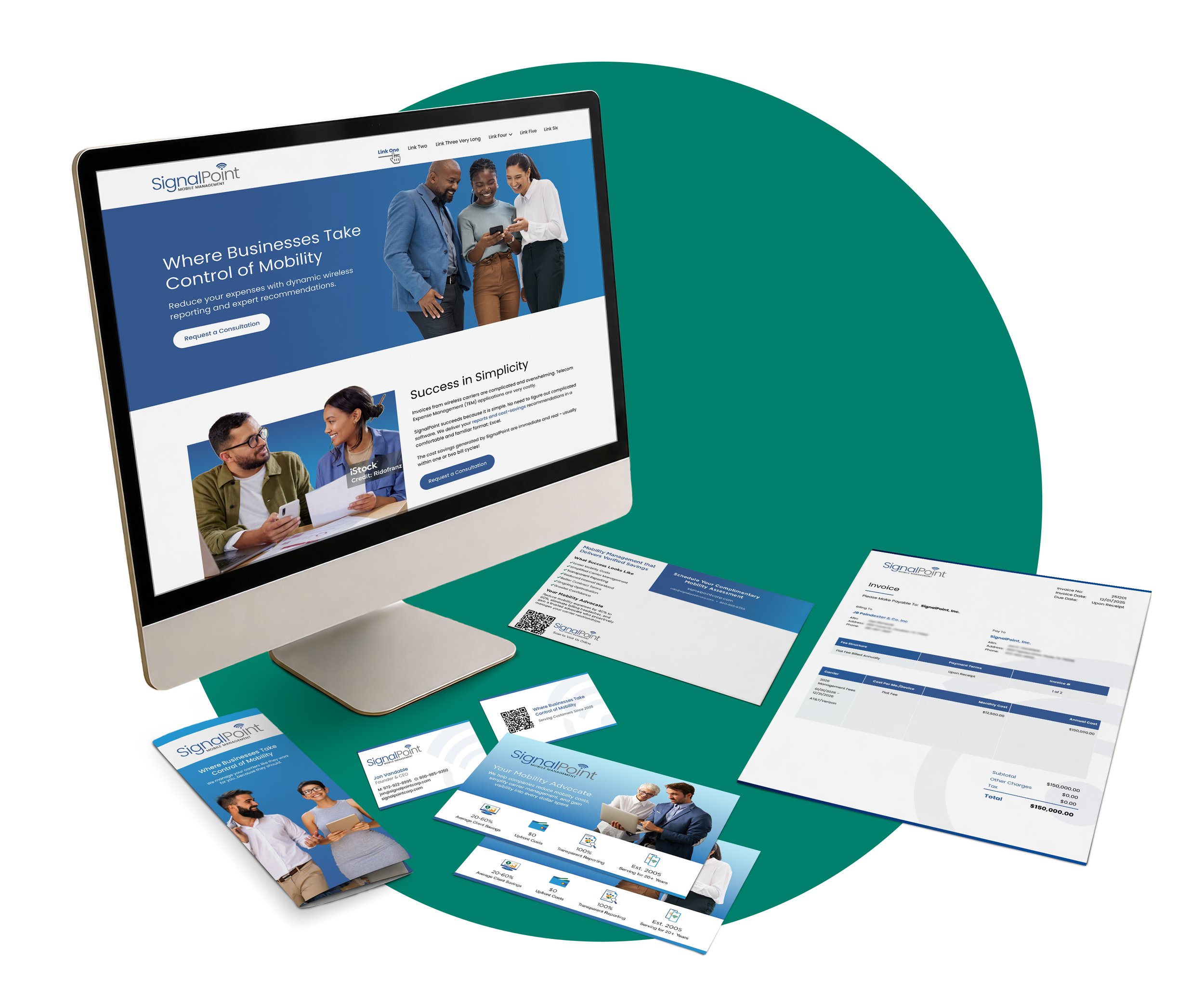
A complete B2B identity and communications system created for a company entering the market with a new name and a clearer story.
About the Work
Industry
Managed mobility and telecommunications
Role
Team Lead & Lead Designer
Scope
Brand identity, website, print, and business materials
Collaboration
Client, content, production, and development teams
The Challenge
SignalPoint was preparing to operate under a new company name without an established visual identity or existing website. It needed a clear way to explain a specialized service, build credibility with B2B decision-makers, and turn early interest into qualified conversations.
The brand also had to work beyond marketing. From the first website visit to a proposal, contract, invoice, or email, every touchpoint needed to feel like one company and communicate the same level of clarity and professionalism.
My Contribution
As lead visual designer, I developed the logo and logo mark, selected the color and typography systems, and established the visual language for the new brand. I then extended that direction across SignalPoint’s first website, brochure, postcard, stationery, business cards, contracts, invoices, and other working communications.
I shaped responsive page layouts, organized service information into a clearer flow, and collaborated with client, content, production, and development teams through direction, handoff, and review. The work connected brand definition, marketing, sales, and daily operations.
Building the Visual System
Brand Identity
Established the logo, mark, palette, typography, and visual rules for the renamed company.
Website
Created a clear B2B story and a purposeful path from introduction to inquiry.
Marketing Materials
Extended the message into brochures and postcards for sales, follow-up, and events.
Business Tools
Applied the identity to stationery, cards, contracts, invoices, and daily communications.
Brand Identity
Because the name change created a new starting point, the logo, mark, palette, and typography were developed as one coordinated system rather than isolated choices.



Website
With no previous site to revise, the information architecture and visual design could be built around the questions a prospective client would ask. The page flow moves from a concise explanation of SignalPoint’s value into services, benefits, supporting detail, and a clear contact path.
The design balances credibility with accessibility. It makes a specialized offering easier to understand without oversimplifying it, and uses consistent calls to action to support interest and lead generation across the site.
Marketing Materials & Business Tools
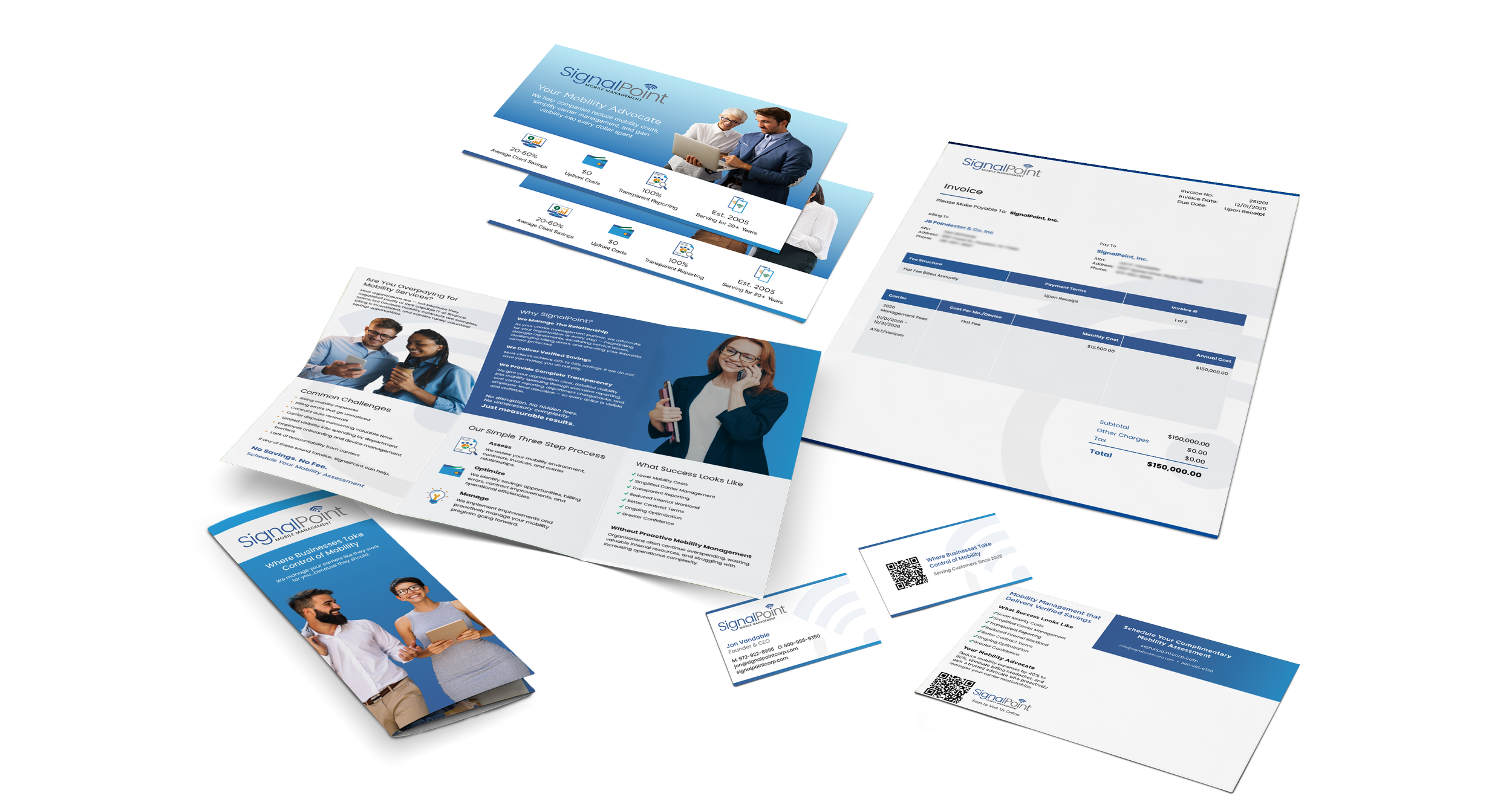
SignalPoint needed a cohesive set of materials for both client outreach and daily operations. I applied the new identity across brochures, postcards, letterhead, business cards, contracts, and invoices.
Each piece was adapted to its specific purpose while maintaining consistent typography, color, hierarchy, and brand details. The result was a coordinated system that felt recognizable and professional without compromising clarity or function.
The Outcome
What began with a company name change became a connected identity and communications system. SignalPoint gained the tools to explain its services to B2B audiences, create interest through a dedicated web presence, and carry the same professional impression into sales and operational touchpoints.
Distinct Identity
A logo, mark, palette, and type system give the new name a recognizable presence.
Clear Digital Story
The company’s website creates an understandable journey from value proposition to inquiry.
Cohesive Client Experience
Marketing pieces and business documents now feel like parts of the same company.