
Residential Capital Partners
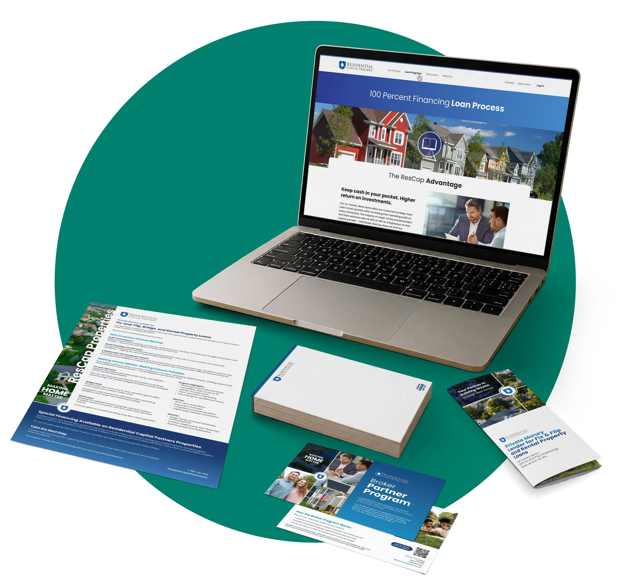
A connected brand and digital ecosystem spanning public marketing, internal resources, borrower account access, loan payments, and print communications.
About the Work
Industry
Private Lending and real estate finance
Role
Team Lead & Lead Designer
Scope
Brand, web, campaign, print
Collaboration
Client, developer, copy writer
The Challenge
ResCap already had a strong logo and a recognizable foundation, but the broader brand experience had not kept pace with the business. Its public website needed to explain the company and its lending products more clearly, create a smoother path to inquiry, and establish a more refined visual standard.
Beyond marketing, employees and borrowers were relying on disconnected or difficult-to-use systems for company information, sales resources, account details, and loan payments. The challenge became larger than redesigning a website: create a coherent experience across every major ResCap touchpoint.
My Contribution
As lead visual designer, I helped refine the color palette and supporting visual language, then carried that direction through the public website, print and conference materials, employee intranet, and borrower hub and payment portal.
I organized dense information into clear hierarchies, designed responsive interfaces, and worked with client, content, production, and development teams from early direction through handoff and review. My contribution was not a single campaign or platform; it was the visual continuity linking marketing, internal operations, and borrower service.
Brand Communications
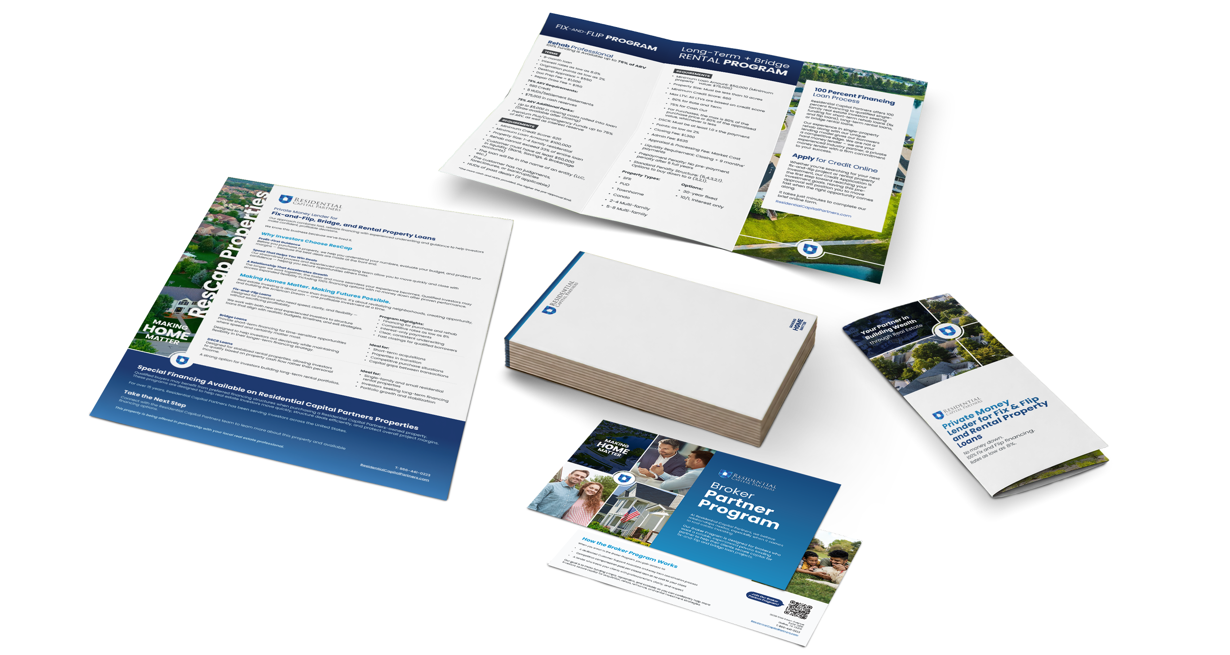
The website established a foundation for flyers, one-pagers, postcard-sized conference handouts, and other client-facing collateral. The broader rollout also included booth graphics and branded merchandise, allowing ResCap to appear consistent whether the interaction began online, at an event, or through an account executive.
Refining the Brand
ResCap’s logo remained intact. The work focused on strengthening the colors, typography, hierarchy, imagery, and supporting applications



Four Connected Digital Experiences
Public Website
Clarified ResCap’s positioning and lending products while creating a more direct path from interest to inquiry.
Employee Intranet
Centralized company news, training, benefits, directories, onboarding, and reusable sales materials.
Borrower Hub
Made account information, AE contacts, shared deals, and important updates easier to access.
Payment Portal
Reorganized loan and payment information for borrowers managing one or several active loans.
Public Website
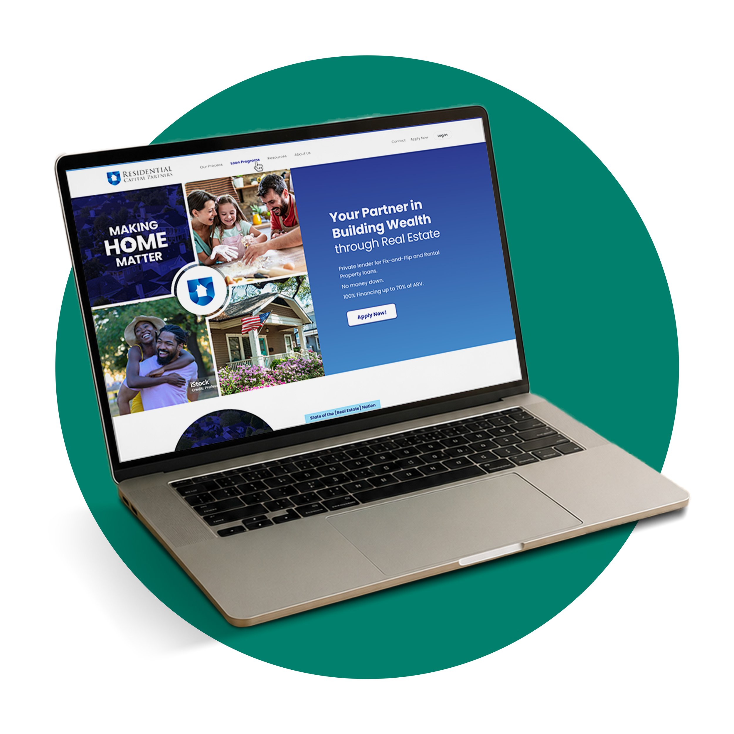
The redesigned site more clearly defined who ResCap is, what it offers, and why its lending model matters. Content and page flow were reorganized to guide visitors from broad positioning into products, supporting information, and a direct route to contact the team.
The refined visual system gave the company a more credible and consistent digital presence. Following launch, the website also began generating more direct inquiries, giving ResCap a clearer conversion path from the site.
Employee Intranet
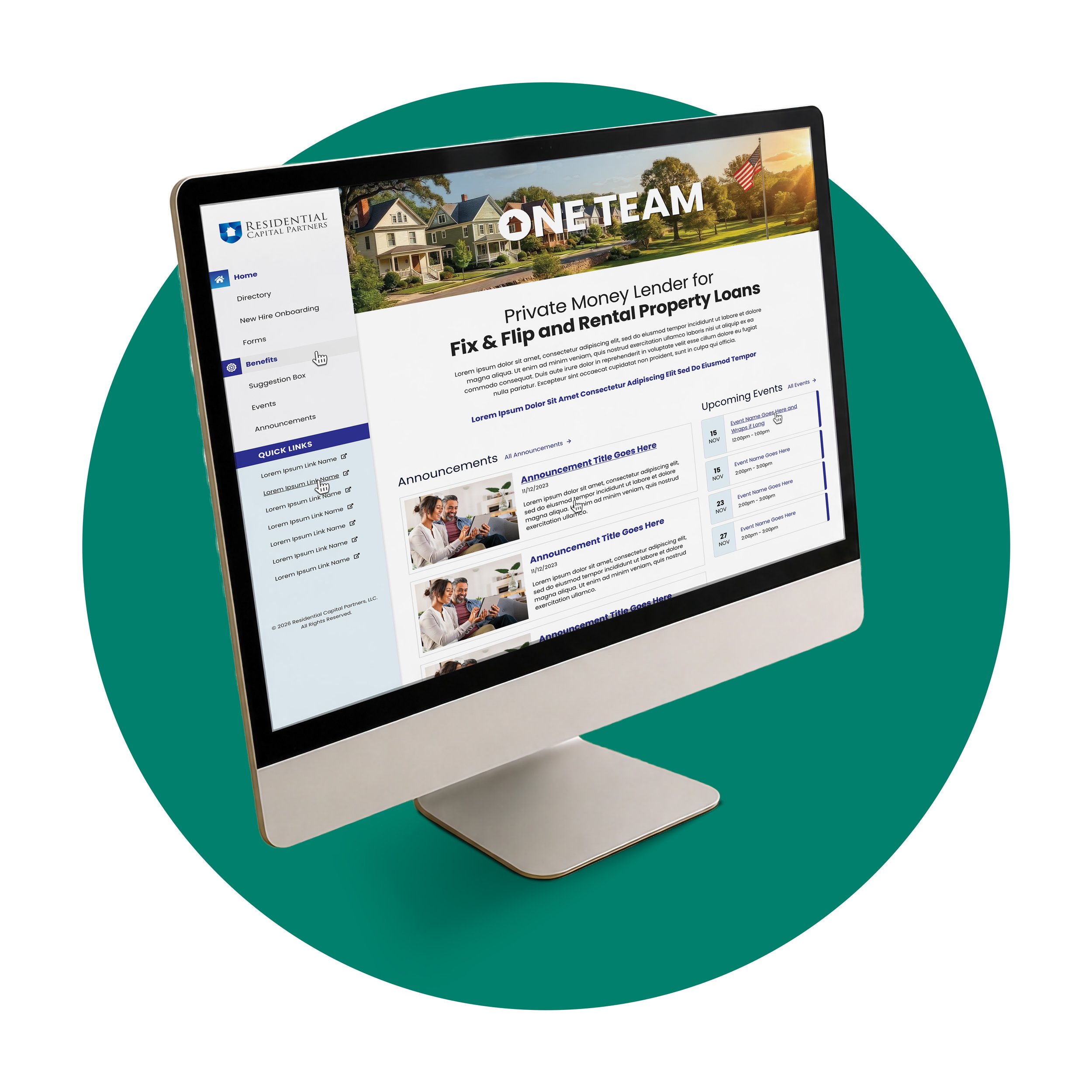
The intranet was designed as a practical internal hub for company news, announcements, event updates, directories, benefits information, onboarding resources, training videos, and frequently used documents.
It also became a repository for current sales materials, giving account executives a straightforward way to find, download, print, and share approved resources without searching across scattered files or outdated versions.
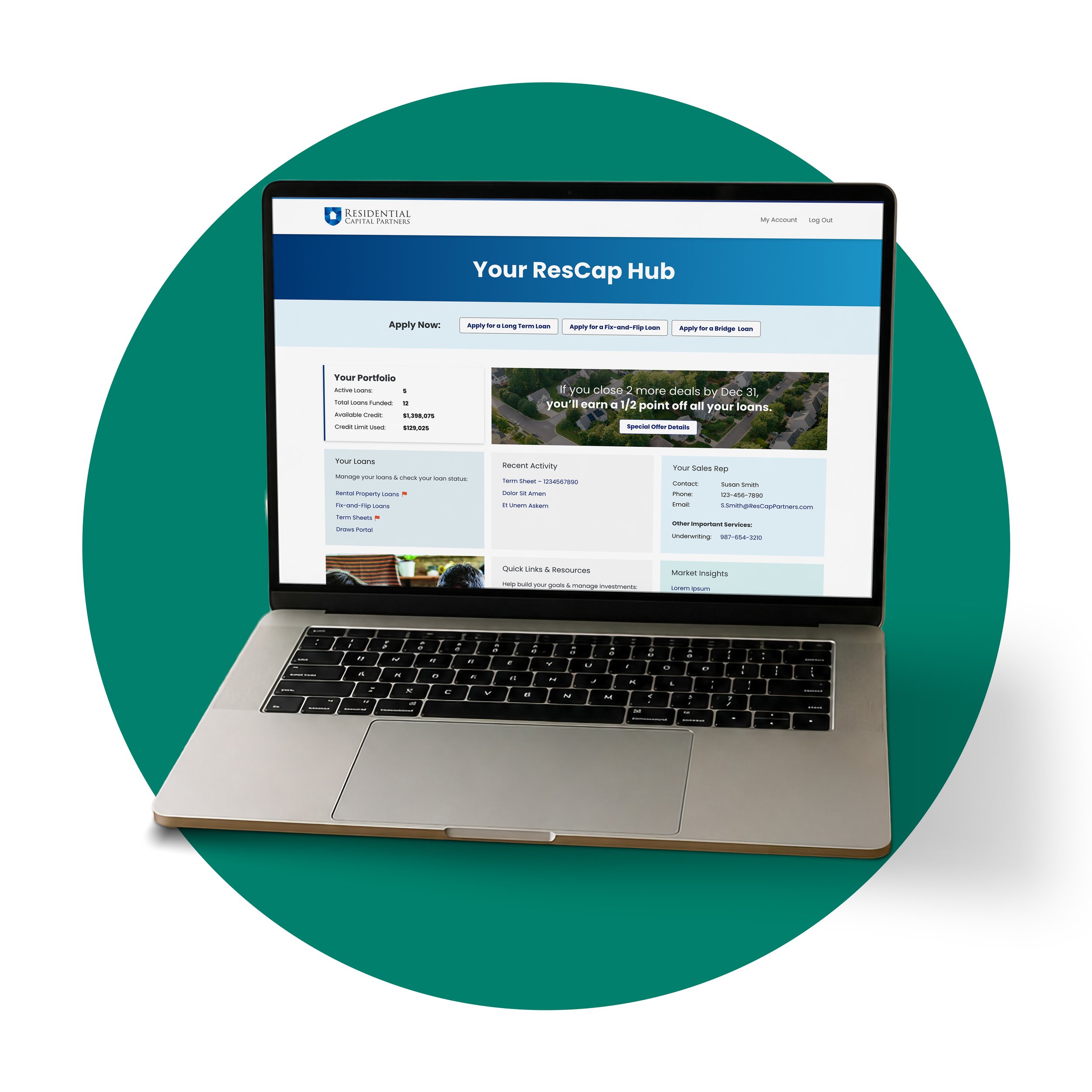
Borrower Hub
The borrower hub created a central access point for account information, account-executive contacts, and important updates. It gave borrowers a clearer understanding of where to find essential information without navigating several disconnected systems.
The hub also gave account executives a dedicated place to share new deals and other relevant information, supporting a more useful and ongoing connection with existing borrowers.
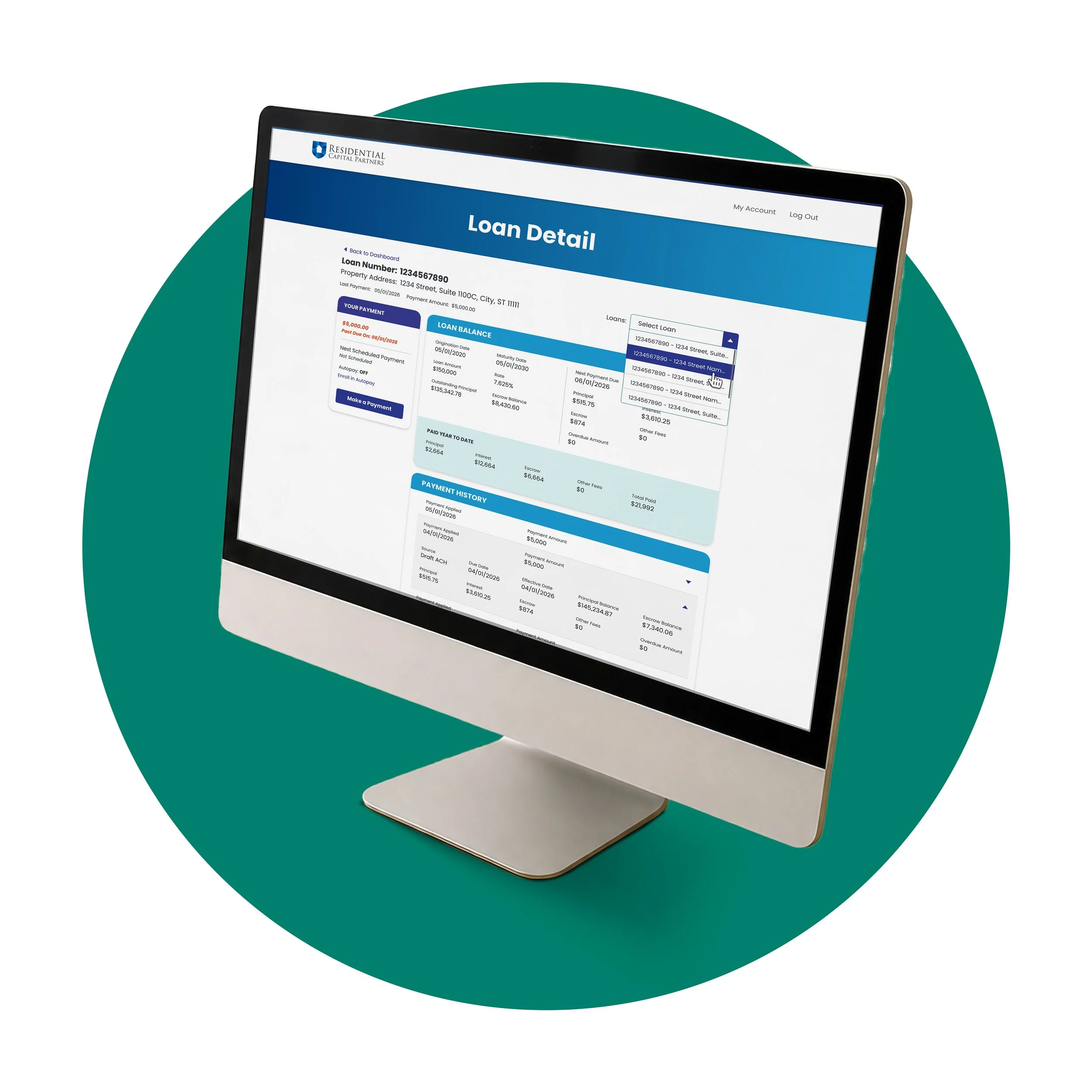
Payment Portal
The previous portal made essential loan details, payment status, history, and payment information difficult to locate or interpret. These problems became more pronounced for borrowers managing multiple loans, and technical failures could sometimes prevent access altogether.
The redesigned experience organized each loan more clearly and made payment activity easier to review, track, and update. My design contribution focused on information hierarchy, navigation, account states, and the workflows borrowers needed to complete with confidence.
The Outcome
What began as a visual refinement and public-site redesign became a connected family of marketing, internal, and borrower-facing experiences. Each platform solved a different problem, but all of them shared the same visual logic and emphasis on clarity.
Clearer Marketing
A more focused public website better explains the business and supports direct inquiries.
Shared Internal Source
Employees can access current information, training, documents, and sales resources in one place.
More Useful Borrower Tools
Account communication, loan information, and payment activity are easier to locate and understand.