
WillowBend Systems
A refreshed identity and business-first digital presence spanning a new logo, color and type system, lead-focused website, and essential brand applications.
About the Work
Industry
Managed IT and cybersecurity
Role
Team Lead & Lead Designer
Scope
Brand identity, website, and print materials
Collaboration
Client, content, production, and development teams
The Challenge
Willowbend had years of technology experience, but its outdated logo and visual identity no longer reflected the stable, proactive, and business-focused partner it had become. The company needed a more contemporary presence that could communicate technical credibility without making the brand feel cold or overly complex.
The website also needed a clearer route through the company’s services, differentiators, and business value. The goal was to help prospective clients understand what Willowbend does, why its approach matters, and how to take the next step without getting lost in technical detail.
My Contribution
As lead designer, I created the new Willowbend logo, selected the color and typography systems, and established a more current visual language. I then translated that direction into the company’s new responsive website, business cards, and one-page company overview.
I organized complex service information into clearer visual hierarchies and page sequences, then collaborated through design, handoff, and review. The final system also provided a visual foundation for social materials developed after my direct involvement ended.
Building the Visual System
Brand Identity
Replaced the outdated logo with a coordinated mark, palette, and typography system.
Updated Website
Organized the company’s value, services, and proof into a clearer path toward contact.
Print Deliverables
Extended the brand into business cards and a concise company-overview one-pager.
Brand System
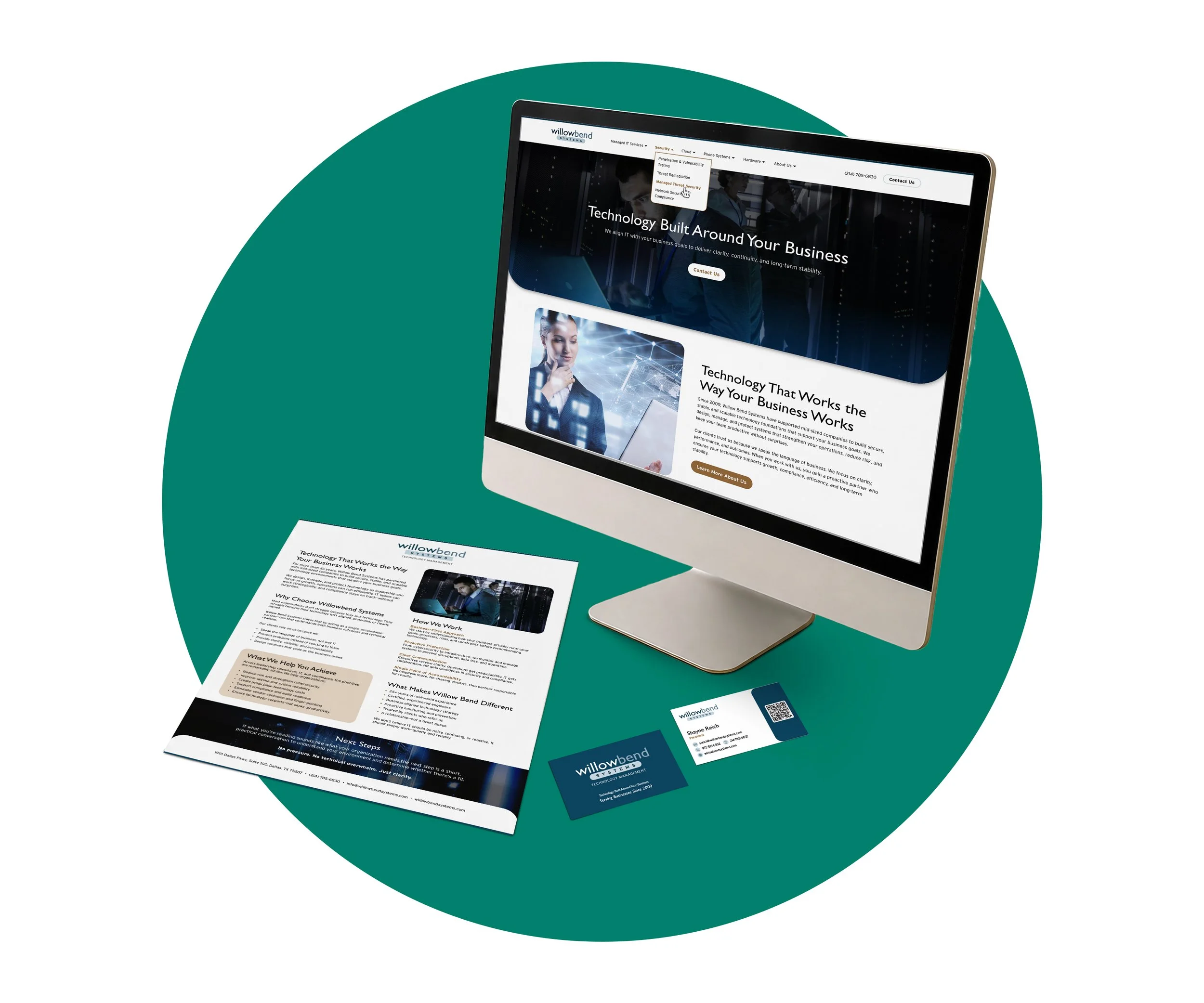
Connected the new identity, website, business cards, and company overview through one consistent visual language.
Brand Identity
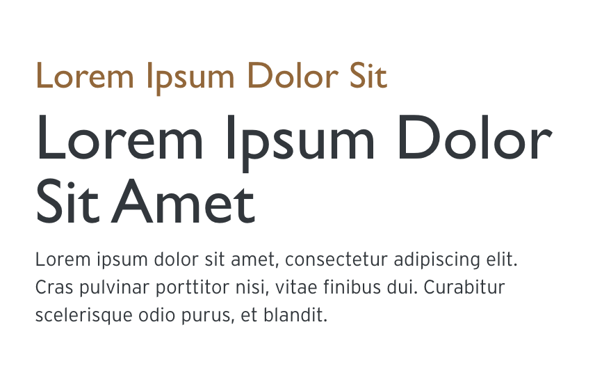
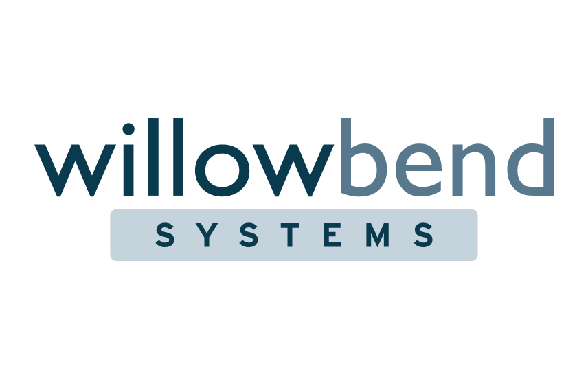
The logo, palette, and typography were developed together so the brand could feel technical and credible while remaining clear, approachable, and useful across channels.

Updated Website
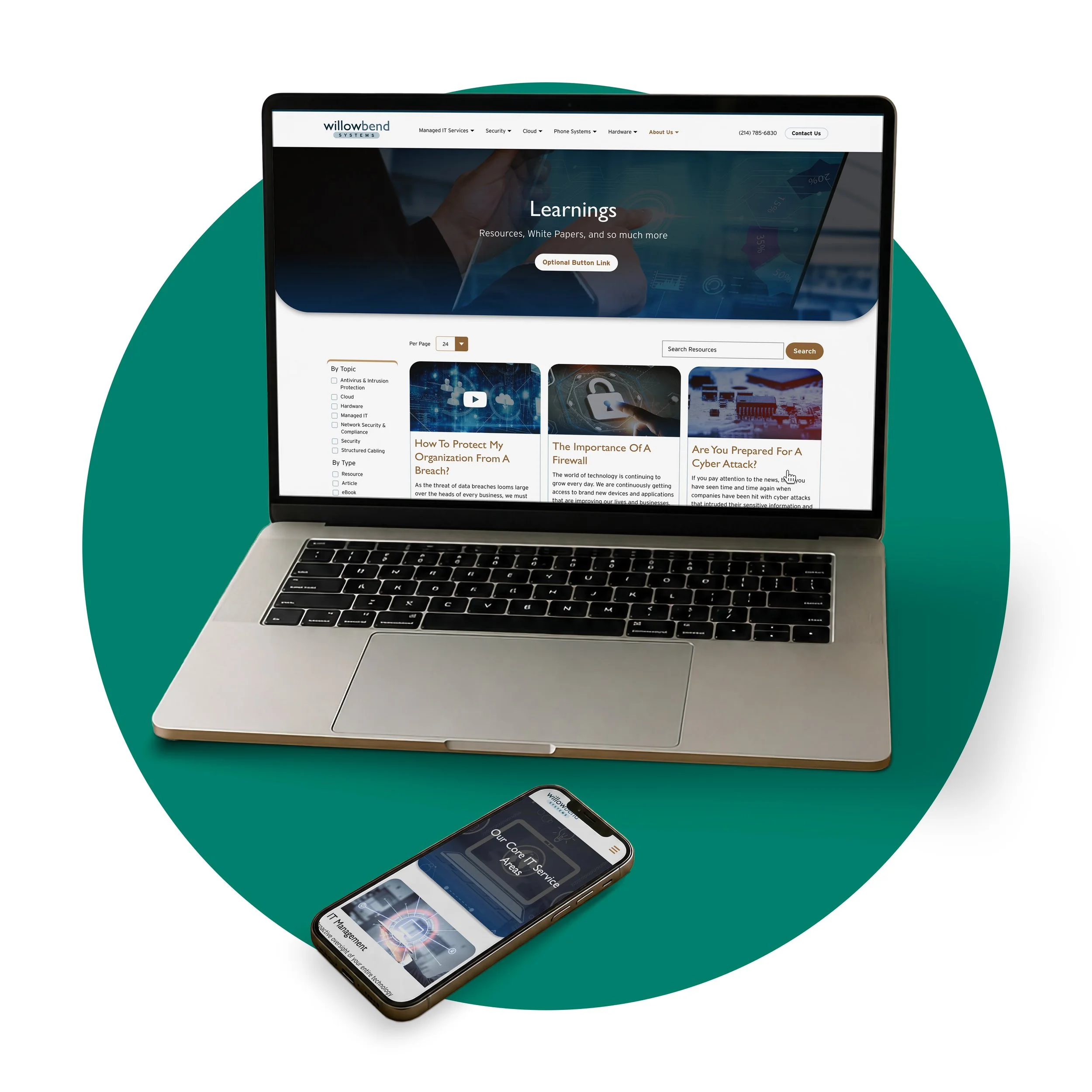
The new website was organized around the value Willowbend provides to the business: secure, stable, and scalable technology aligned with operational goals. The page flow moves from the company’s core promise into differentiators, service categories, supporting proof, and a clear contact path.
Clear navigation, structured content groups, and repeated calls to action make a broad service offering easier to understand. The experience supports interest and lead generation while keeping the emphasis on business outcomes rather than technical complexity.
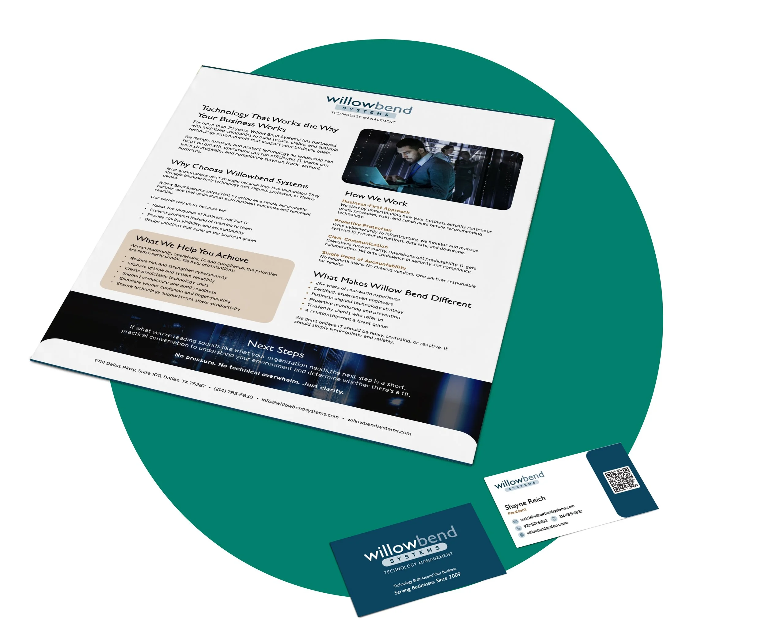
Print Deliverables & Brand System
Willowbend’s identity was developed to work as a cohesive visual system rather than a standalone logo. I carried its colors, typography, imagery, and hierarchy through the website, business cards, and company-overview one-pager, adapting each application to its purpose while maintaining one recognizable brand presence.
The Outcome
The engagement gave Willowbend a complete visual reset and a more purposeful digital presence. The new identity, website, and supporting applications now work together to present the company as an experienced technology partner focused on clarity, stability, security, and long-term business value.
Updated Identity
A new logo, palette, and type system better reflect the company Willowbend has become.
Clear Lead Path
The website guides prospective clients from business value into services, proof, and contact.
Flexible Visual System
Print and handoff materials can extend the same recognizable direction across channels.